Showing posts with label values. Show all posts

Friday, July 15, 2011

"The Swimmer"...WIP

I didn't have a lot of time to paint today, but did manage a little time with my brush and paint.  Here is today's progress.
This is turning out to be some pretty tedious painting so things move along rather slowly.  At the moment it is difficult for me to wrap my head around the painting like I should so I just have to paint a little bit at a time.  I paint a little, leave it for a little while, then come back and paint a little then repeat the steps all day long.  Not the most ideal way to paint because I can't really get in the flow of the painting but it is the best I can manage at the time.  Do you ever have to just "make do" with the time you have to paint... and be happy you have that much?

These are some thoughts from Timothy Clark when he was at Watermedia 2003 in Houston. (Gosh that was a long time ago!!)

  • Line inherits shape, shape inherits form, form is enhanced by value, value is enhanced by color.
  • Pattern is 2-D and texture is 3-D.
  • If you deal with shape and value, form will take care of itself.
  • Composition is the way you organize the elements ~ organize with an underlying element (ie - triangles)
  • Be aware of the emotion that you want.
  • Local color + Light + Shadow = fully rounded form.
  • If you paint orange on top of yellow your blue won't turn green in a sky.
Be Still My Art,


Kay


Thursday, July 14, 2011

New Painting

Yesterday I started on a new painting.  I did the drawing and used maskit on the areas I wanted to remain white.  That was pretty tedious work so I didn't get any painting done other than a wash of blue over the entire painting.  Today I have had more time to paint so I have made decent progress on it.


This is one of those paintings where the details will make or break things... IMO!  I don't have a lot of patience so I have to work on the painting a bit, then get away from it for a bit... then go back and work on it some more, and so on.  Slowly, usually very slowly, it begins to pull together.    Do you ever work on paintings with lots of details?  Do you ever get lost in all the little shapes?  Value will be a big key to this painting... that is what will pull the small shapes together into big shapes.

 Color Formulas (in case you don't have them already or have forgotten about them...):
  • Burnt Sienna + Ultramarine = very attractive gray which dries with subtle granular patterns. (An excellent mixture for painting skies)
  • Raw Umber is ideal for dulling blues, yellows and greens.
  • Paint several sequences of colors in areas that move from light to shadow:
                   Red, Carmine, Violet - warm shadow
                   Thalo Blue, Ultramarine Blue, Violet - cool shadow
  • A neutral gray blue - Cobalt Blue + Burnt Sienna
  • Shadows:
                  Dark Shadows- Winsor Blue + Permanent Alizarin Crimson
                  Intermediate Shadows- French Ultramarine Blue + Perm. Aliz. Crimson
                  Subtle Shadows- French Ultra. Blue + Perm. Rose
                  Vary the shadows from cooler (more blue) to warmer (more red)
                  Warmer in foreground, cooler in background

Be Still My Art,

Kay         


Monday, July 4, 2011

My Color Notebook and More Tips... (Oh! No! Not more on Value!)

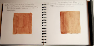
The past several days have been especially difficult as we had to put my Mom in the hospital on Saturday.  She apparently has cancer that has spread to several places in her body.  We will know more on Wednesday but until then I am struggling to maintain some control... Mom has lived with us for the past 16 years so it will be especially difficult to let her go.  I sit at the hospital desperate to separate myself from the situation so I work on art related things that can be done on the "fly" with few supplies.  Today I penciled in some quick exercises in one of my sketchbooks so that when I had a minute I could just add the color to them and my samples would be nice and tidy in an actual book instead of "floaties" that tend to disappear.  When I got home tonight I just had to hold a paint brush in my hand for a while (at least I can control that, right?) so I painted a few of the samples.


I can also round up all the "floaties" and put them in the book and everything on color will be in one place.... well, almost everything on color.  What about you?  Do you keep notes on mixing colors and samples of different formulas?  What do you keep yours in?

I hope you are starting a notebook on value... if so, here are even more tips that I found on a handout that I have.
  • Place a middle value first for a better grasp of the whole range of value and to reveal light areas.  Add darks last.
  • Full value range paintings lack a dominance... omit unnecessary values.
  • Take a black and white picture of your painting.
  • A small halo of light accents an edge where it meets a dark.  Conversely, a small gradation of darker value will relax the same edge.
  • Keep middle value paintings in the #4 to #7 range... middle values hold a painting together.  We need middle values in large areas or shapes for cementing.  They are the walls that support your windows of light or upon which darks can be patterned.
  • Dark value paintings should be kept in the #5 to #10 range.  They give punch, drama and like light values can be used for structural unity. 
  • Light value paintings should be kept in the #1 to #5 range.  Light values give life, breath and sparkle to a composition and can be used for structural unity.
  • A photo of a sunlit subject usually blackens cast shadows.  Lighten these and put more color into them.
  • Alternate value contrasts along extended edges.
  • It takes a value change to separate a tree from the sky.  Don't rely on a color change to separate it.  Even worse, don't rely on texture.
  • Most brighter colors come to full intensity in mid-value
  • Give most of your attention to the four to seven largest pieces of value in your painting.  If these few large hunks are not the most distinguished shapes you can make, your painting will fail.
Haven't had a chance to work on "Daydreaming" but maybe soon I will have an update on it.

Be Still My Art,

Kay


Thursday, June 30, 2011

A Few Tidbits on Color and my WIP

These are just a few tidbits on color that you may already know... hope you don't mind a short reminder.

   If you want a color to look:                 Paint next to it:

  • More intense                                   Its complement
  • Less intense                                    A more-intense version of the same or a near-hue
                                                                          (Its neighbor on the color wheel)

  • Darker                                            A lighter value
  • Lighter                                            A darker value
  • Cooler                                            A warmer color
  • Warmer                                          A cooler color
A color that is surrounded by black or a dark value will appear lighter, brighter and larger than it actually is.
A color surrounded by white or a light value will appear darker, duller and smaller than it actually is.

More to come on color at a later time...

I worked on "Daydreamer" today and it seemed that the more I painted on it the more that needed to be done.  Ever get to that point in a painting where you just really have to push yourself to "just put paint on the paper" and not get caught up in all the little details that will come later?  I could have spent all day on just one little section, but I like to paint the entire painting and hold off on the details until last.


Doesn't look like a lot of progress... but any time you are moving forward it is a "good thing", right?

Be Still My Art

Kay

Wednesday, June 29, 2011

Work in Progress... values

Things felt good this afternoon as I had some uninterrupted painting time.  As I worked on this painting I was thinking a lot about the values I had planned.  Instead of working the entire painting like I did yesterday in just trying to get some color down, I started working more on individual areas of the painting.  It is difficult to judge the values when you don't have much color surrounding the area you are working on.  So, I pulled out an old value chart that I probably cut out of a book and punched holes in... so I had something to compare the values to.
Value chart on white paper
                           Value chart over the painting... what value would you say
                            the blue is?  It looks like a great middle area value to me...
                                only problem is it is supposed to be a dark value in that area.            


Here is the painting so far... remember it is a WIP!
Daydreamer.... in progress
I keep a poster on my wall that I made about analyzing a painting.  Of course it comes from some book that is long gone... sorry.  It reads:

All details must be eliminated so each object in the painting
is reduced to its basic shape.  Then the structural skeleton can be seen.

The examples of this are paintings by Grunewald and El Greco:
Altar Triptch by Grunewald

Kneeling Saint by El Greco


Notice how the paintings are reduced to three values in black, white and grey and then simplified by removing details and combining shapes.  I seem to be able to do that in my planning... now the trick is to carry it out in the final painting.  Sounds so easy, doesn't it???  Do you find it that easy to do?  Not me!

Be Still My Art,


Kay


Monday, June 27, 2011

More on Value and a WIP

My Mom (who is 90 years old) had some medical tests run last week and sitting in the lobby waiting brought back memories of when she had a stroke several years ago.  At that time I was in a critique class led by Polly Hammett.  Polly is a master at design and composition and really emphasized underlying abstract value designs.  She suggested that we take old art show catalogues and look at the value patterns of the winning entries and/or paintings that we liked.  By putting a piece of tracing paper over the photo one could see the larger value shapes in each painting.  I happened to have a sketch book that I had made by putting a sheet of drawing paper and then a sheet of tracing paper, until I had enough pages for the book.  To pass the time while at the hospital I started my Value Patterns Book...

Award winning paintings
Value Patterns of the paintings
Award winning paintings
Value Patterns of the paintings


Stephen Quiller


 I filled an entire sketchbook with the underlying abstract value patterns of winning watercolor paintings and also with the paintings of artist whose work I admire.  It was a very soothing exercise and I think I really learned a lot from doing it.  One thing I began to notice in all the value patterns was the use of large value shapes.

Value Patterns

Arne Westerman


Today I finished the drawing on my next painting and got the first glaze put on!!  Yea me!  Persistence and perseverance... one little step at a time.  Any progress is good progress... as long as it is progress in the right direction!
Work in Progress


Be Still My Art,


Kay

Wednesday, June 22, 2011

Gladiolus

Gladiolus
Watercolor and Pen and Ink
4.5" X 13.5"
I wish I could say that I stepped out into my yard the other day and cut these gorgeous gladiolus from my flower bed... but since I have a major brown thumb I would be fibbing if I said something like that.  The best I can do is pick them up at the store... but they are still gorgeous.  I took a few minutes after breakfast to do a contour line drawing of one of the stems.  I wanted to do a small painting to see if I liked it enough to do a larger one later.  For me this painting wasn't much fun.  That "wow" factor had been missing from the get go so my heart never was in it.  Even though it was a small painting I really had to push myself to stay involved enough to even complete it.  Do you ever find yourself in a spot like that?  Since I had started it I felt like I should follow it through to the end but it was almost like punishment.  So, maybe for me a lot of the "Wow!" factor comes in the "discovery" of the painting and the planning that goes into the painting at the start.  I love to design the paintings and work with the values and most of that preplanning was missing from this painting.  Maybe next time I should work with a better light source and the dazzle that is so necessary for me will be there!! 

Be Still My Art,

Kay


Saturday, June 11, 2011

The Prodigal

My son and I like to go to estate sales once in a while.  There are often lots of treasures to be found... you should see the watercolor paper I have gotten at a bargain price!  Once in a while we will get to a sale and the sellers will be limiting the number of people who can go in at one time, so we have to wait outside until it is our turn to go in.  Not too long ago we were waiting and it was already getting pretty hot when my son put his arms on the gate and laid his head down... and bam!  There it was ~ the sun shining on his back and arms and the entire situation changed for me.  Instead of being at an estate sale I was planning a painting!  Actually I was still at the sale but my intentions changed.  Instead of bargain hunting I was grabbing for my phone (I didn't have my official camera with me!) and ordering my son not to move!

The photo isn't the quality I could have gotten with a "real" camera instead of a phone, but it was certainly good enough to bring back the feelings the moment had provided... I just knew there was a painting in there.  I don't know how you work, but often I mull a painting over in my mind for several months before I do anything about it... other times, not so much!!  This time I thought about the painting for a long time before finally putting it on my computer and into photoshop where I played with it a bit.
The first thing I did was crop it to make it a horizontal painting.


The next thing I did was bump up the contrast and the saturation of the colors.

It is already looking better.  Next I discarded the color so I could work with the values.  I had to isolate a couple of areas so I could make them darker or lighter.  When I had the values the way I thought I wanted them I posterized it at level 3.


Then I just had to draw it on the watercolor paper and paint it.  After I had worked on it a while I asked Susan Giannantonio to critique it for me.  She had a few suggestions... some I took and some I probably didn't. :>}   


The completed painting... Body Language: The Prodigal   
(I think it is a long distance from the gate where the man is to the front door... what is keeping him from going on in??  Why does he appear so dejected?  Lots of unanswered questions...)
The first in a series on Body Language.  
And now you know how I work from start to finish of a painting.  How bout you?  What tricks of the trade do you use when painting? 

Be Still My Art,
Kay